Thursday, March 31, 2011

Hey, Old Man!

Again, refining my sense of color and digital painting, with a bit of relaxing thrown in after trying to pump out a portfolio to send to Pixar. I was trying to imply a little bit of form but mostly leave the old man feeling fairly flat. Are we feeling that effect? Is it appealing? If it weren't time for bed he would have been walking a dog.

Little Brother: Rough


This is a rough of the first page of the first book I'm illustrating for work. The tittle is awkward because it will be in chinese. 

On this page big sister is frustrated because little brother is always using her stuff to build simple machines wich makes it hard for her to study. I'm up for suggestions as to what else he could be using to make the device... I'd even be interested to hear more interesting suggestions for the device itself. 

Wednesday, March 30, 2011

The Magic Hobo Returns


Pumped this out for my portfolio, but I am such garbage with colors. Are any of these remotely working? Or any suggestions for a good color scheme? I left his accessories uncolored on purpose, because I like the idea of uncolored line art, and I want him to pop more.

Hmm... Another Variation


So hard to decide... Any feedback would be marvelous.

Tuesday, March 29, 2011

Giant Progress


I'm not totally finished with this yet, and I'm opened to suggestions. I'm thinking about adding a little more interest in the costume... near the shoulder area... anyways...

What? More elephants?!

More working with color and digital painting. Elephants just provide something to quickly focus in on. The water underneath = fail. In retrospect, I wish I had him cannonballing into a sea of elephants. Then he could be yelling, "What? More elephants?!" I suppose it's not too late to come back to this one.

Monday, March 28, 2011

Out of my depth

I'm actually embarrassed at how much time I put into this. I had meant for this to be simpler and then I had something of a happy accident and now here we are. After the elephant, I was at a loss for what to do on the background, and I wish there was some more story here. But I like it today. Who knows how I'll feel about it tomorrow?

Saturday, March 26, 2011

Time Crunch

I've had no time today except to work on my project. Here's another tidbit:

A Disagreement


I wish the lizard man was in a more active pose. It would justify the barbarian's strain. I also wish the lizard man was a space lizard man with a ray-gun instead. Maybe I'll revisit it... maybe I won't. 

Thursday, March 24, 2011

Steve and Ringo Title Card 1st Iteration


I decided on a title for my 2nd assignment, and this is the title card I created for it. I wanted some whimsy and something that prepares you for ridiculousness. The font needs a little work, and the colors too. I don't know if I like the texture background yet. It's kind of just temp so I can go to bed. Thoughts?

Melvin

Wednesday, March 23, 2011

Customers 2 Sketches

I didn't bother to color these ones after yesterday's scanning fiasco. I'm tired. Also, we should probably have at least one well-groomed male in the line-up.

Study


Just a quick study from a photo.

Tuesday, March 22, 2011

A Tribute to Something Amazing


Customer 1 Sketches

2 iterations of a possible salon customer. Focusing on shape. This one just worked better as an old people.

 As a note, I'm pretty ticked off at my scanner at how badly the color on this scanned. Unacceptable. I'll try and rescan tomorrow on a real scanner.

Sunday, March 20, 2011

Preview for Assignment 2 "On Ice"

So, the first thing was not really working out in the time frame given (due on Wednesday). I scrambled, found some ridiculous action figures at Shopko, and fit them into a small portion of a ridiculous comic I made during a plane ride. It's fun. And the 1st real experience with stop motion is yielding some surprising results (some good, some not so much).

Saturday, March 19, 2011

Peter and the Wolf

Been toying with the idea of some Peter and the Wolf character designs since earlier this week. And every time I do I have Tchaikovsky's music stuck in my head. I wish you could see the colors in my sketchbook. I don't believe the scanner is doing them justice. Criticisms?

Friday, March 18, 2011

Book Illustration Exploration


One of my new projects at work is to make 100 illustrations for five books in an educational series. The purpose of the books is to teach children Chinese. I don't have any of the text yet, so I'm just doing some style exploration. The text here is just filler, and I have no idea what it says... hopefully nothing offensive.

I have created a small set of brushes for this project. The middle page is just me playing around with the new brush set. 

Thursday, March 17, 2011

Sneak Peek of Assignment #2


Wanted to do something else to put up here, but spent all evening after work working on my second assignment for the Experimental class (STOP MOTION!). So here is a picture of some progress. I'm planning on doing interchangeable heads, but I may not be able to use this one if he doesn't fit in the clothes Shannon is sewing for me. Therefore if you have any helpful advice or criticism for this let me know.

Frankie #2


Still searching for the best solution. The phone needs a little more structure... and I'm not sure about some of the shape sizes. 

Wednesday, March 16, 2011

On Hold


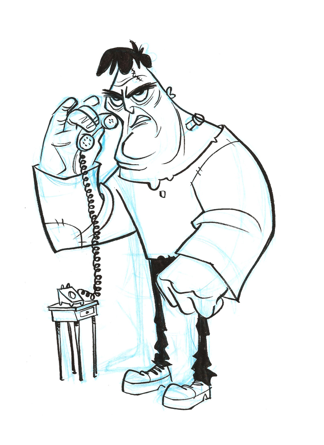
I have been doing variations of this one for a long time now... one of those "can't quite get it right" things. Mostly I want to work on making amusing, readable moments (storytelling) + good design.... this one's not there yet.

This is also one of my weaker inkings of the character, but it's the first time I've tried to solve the whole figure. His left hand really bugs me. Is he trying to give someone a knuckle bump? Anyway this will be a several day project and I'd love some feedback. What might be an amusing caption if this were a one panel comic?

How To Juice A Lime

Yup. This was fun to do.

How To Juice A Lime from Jeff Call on Vimeo.

Sunday, March 13, 2011

Title Cards for Experimental Film.


Here are the key frames for the title cards to my first experimental animation assignment. Trying to drive for a little bit of that UPA/ Jay Ward look. Any suggestions on little details that will make this go further are appreciated.

Saturday, March 12, 2011

More Batmans

I think I may have finally succeeded in getting them out of my system. Sorry for the guilty pleasure.

Red


I couldn't help it... I had to do a superhero too. You'll notice that his costume isn't 100% accurate because I didn't give him those cool shorts he wears. In their place are probably the movie version leather pants (I'll do better next time). Side note; I highly recomend doing a google image search for "ray gun". You won't be disappointed.

Friday, March 11, 2011

BATMAN!

Sometimes you just gotta draw some superheroes. It's kinda fun to play with their designs.

Bird Combo


Just a quick study putting a couple different kinds of birds together (I have no idea what kinds).

Thursday, March 10, 2011

More Retro


The Negotiator

Was working on some boards based on real life. Here's an image from it, that was fun to do, and made me stretch out of my comfort zone. These boards are going to be really fun I think. This image kind of has a Johnny Quest vibe, come to think of it.

Ronald


Wednesday, March 9, 2011

An Emulation...

Done on paper with a brushpen. 5 points if you can guess what artist I was trying to emulate. (This is more a test to see if it works than a test of artist knowledge)

Tuesday, March 8, 2011

UPA Background Attempt #1

After watching 3 hours or so of Rocky and Bullwinkle and Friends (thanks Netflix Instant!) yesterday, I really wanted to try a hand at those beautifully simplistic yet textured backgrounds. I got lost though, and muddled like Bullwinkle, unable to spell my own name. And I tried to do this digitally, where they did it physically like stalwart manly men. I noticed I think they used charcoal or chalk for this really great texture but then it would also have splotches. Mostly I need to do some more looking before I try more doing. The little dude was just there to try and make it feel more contextual although even he fails. Whump whump... (sad trumpet noise)

Boom!!! Blam! Blam!


Some experimenting. Wish I could finish it.

Monday, March 7, 2011

My Weekend in a Nutshell

Yey, roadtrips are so fun. This is essentially it, with a tip of the hat to Richard Thompson, cartoonist behind Cul de Sac, the best comic strip running right now.

Next time I'll put more time into this. I could be having a lot more fun with it.

Balloon

Saturday, March 5, 2011

By Jove!


I drew a rough version of this last night but didn't completely finish it or post it until this morning. So technically it is late. Knowing that it was going to be a little late, I intentionally played to a few of Jeff's style-weaknesses (goofy tastes)* in the hope that I would be forgiven for my tardiness. 

*I should also mention that I really like that kind of stuff too.